Use a link when the user goes somewhere
<a href="…" >
Use links for navigation to pages, sections, files, email addresses, phone numbers or other resources.
Buttons do things. Links take you places. A tiny classroom for designers and developers who want to stop arguing with HTML.

<a href="…" >
Use links for navigation to pages, sections, files, email addresses, phone numbers or other resources.
<button type="button">
Use buttons for actions that change, submit, open, close, reveal, save, delete or otherwise affect the current interface.
Choose the HTML element based on what happens when the user activates it. Then style it to match the design.
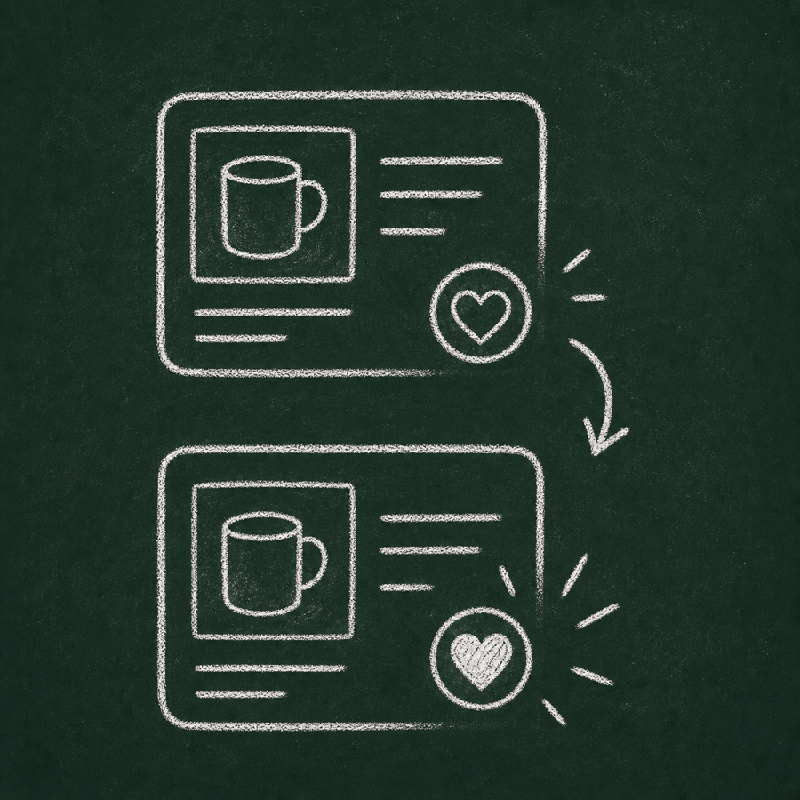
Looks like a link. Still a button.
This content was revealed in the current interface.
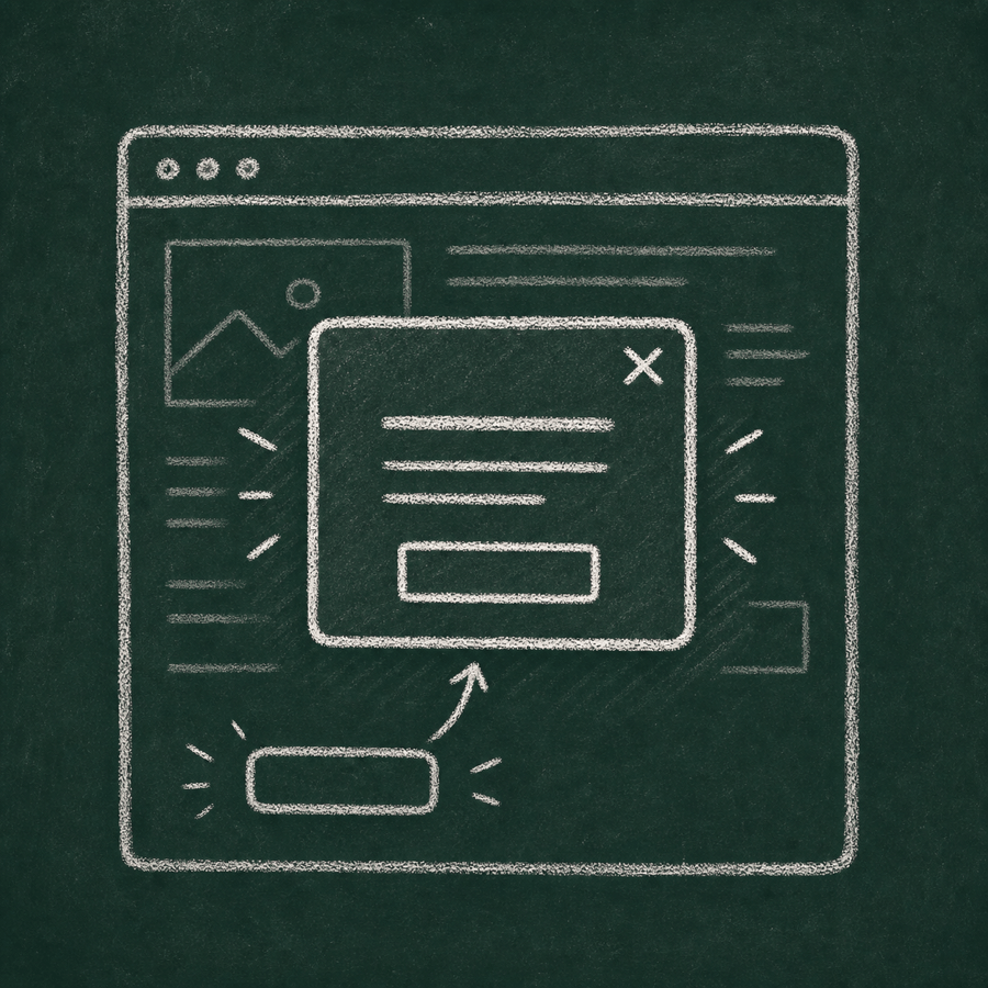
Use a <button> when the control reveals content, opens a modal, toggles state or changes the current interface.
<button type="button" class="link-style">
  Show details
</button>Looks like a button. Still a link.
Use an <a href> when the control takes the user to another page, section, file or resource.
<a class="button-style" href="/pricing">
  View pricing
</a>Answer the question based on what the control actually does, not how it looks in the design.

What should it be?
Answer: link
It takes the user to the product page.
What should it be?
It changes state on the current page.
What should it be?
It opens an interface layer, not a new location.
What should it be?
Answer: link
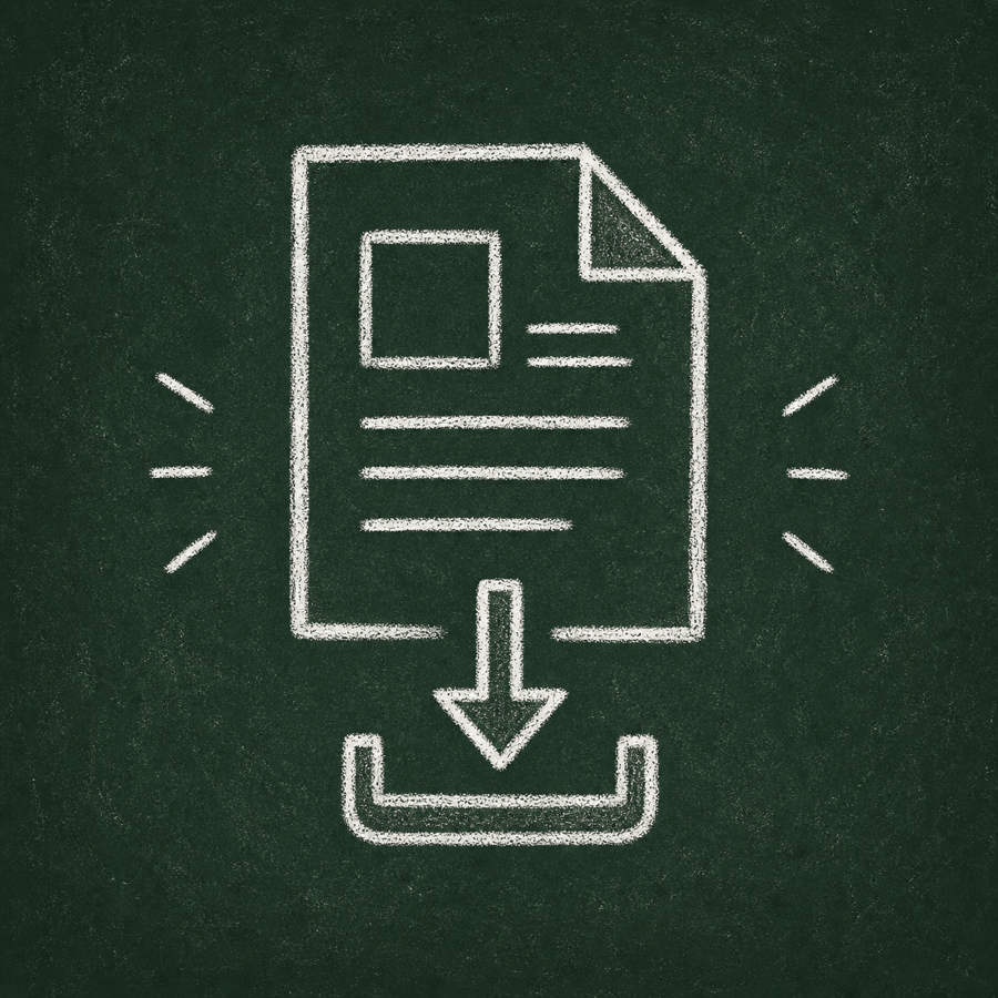
A file is a resource. Users should be able to copy, open and save the target.
What should it be?
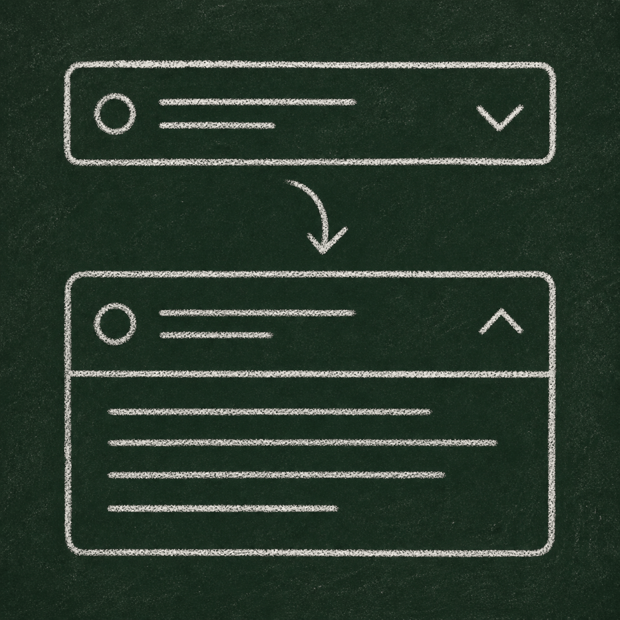
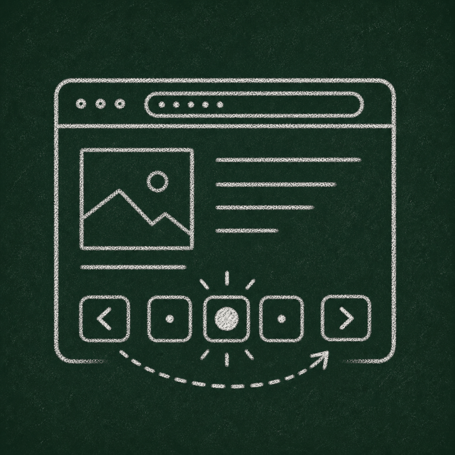
It expands or collapses content.
What should it be?
Answer: usually link
Each page usually represents a navigable location with its own URL.

What should it be?
It changes the order of content on the current page.

What should it be?
Answer: usually link
It usually navigates to another language version of the current page.
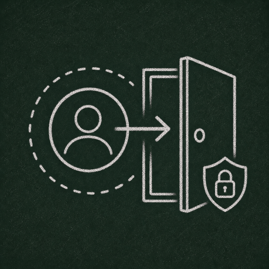
What should it be?
It performs an account action, often with security consequences.
<a href="/pricing">Pricing</a><button type="button" aria-haspopup="menu" aria-expanded="false">Open menu</button><a href="#" onclick="saveSettings()">Save settings</a><button type="button" onclick="location.href='/pricing'">Pricing</button>A button and a link are not just visual styles. They expose different roles to assistive technologies and have different expected keyboard behaviour.
Important: This page is designed to support WCAG 2.2 AAA and EN 301 549-aligned implementation, but compliance still requires testing in the final production context, including content, design, browser behaviour and assistive technology support.
These checks are included as reminders because they are easy to break when the visual design changes.
Test with system dark mode enabled. Text, borders, focus indicators and verdicts must remain readable.
Increase browser text size and verify that content grows without clipping or overlapping.
Test at 200% and 400% zoom. The page should remain usable without horizontal scrolling, except inside code examples.
Test narrow widths around 320 CSS pixels. Navigation, forms, cards and buttons must remain easy to operate.
Five solid references for the next lesson.
Good reference for native button behaviour and when buttons perform actions.
Good reference for links, URLs, fragments, downloads, email and phone links.
The WCAG connection: controls need correct programmatic names, roles, states and values.
Practical explanation of keyboard behaviour, screen reader expectations and common examples.
A useful deep dive into what breaks when custom “clicky things” imitate native controls.